# required packages
library(readr)
library(tidyverse)
library(maps)
library(viridis)

# load the dataset which you have downloaded
# please change the location to where your downloaded file is kept
hap_pre <- read.csv("datasets/2022.csv")

# renaming column names of ease of use
colnames(hap_pre)[2] <- "country"
colnames(hap_pre)[3] <- "score"
hap_pre <- hap_pre[-147,]

# the score values are separated by commas
# let us change that to dots
hap_pre$score <- scan(text=hap_pre$score, dec=",", sep=".")

# selecting country and score columns
hap <- hap_pre %>% select(country,score)

# removing special characters in df
hap$country <- gsub("[[:punct:]]","",as.character(hap$country))

# loading map
map_world <- map_data('world')
# remove Antarctica
map_world <- map_world[!map_world$region =="Antarctica",]

# checking which country names are a mismatch between map data and the downloaded dataset
anti_join(hap, map_world, by = c("country" = "region"))1 Introduction
World Happiness Report 2022 shows which are the happiest countries for the year 2022. By statistically analysing six key parameters, each country is given a score (which is called happiness score within the dataset). The higher the score, the happier the country is and vice versa. The six key parameters which are taken into analysis for determining the score are;
- Gross domestic product per capita
- Social support
- Healthy life expectancy
- Freedom to make your own life choices
- Generosity of the general population
- Perceptions of internal and external corruption levels.
Finland is ranked first among 149 countries with an overall score of 7.82. Despite COVID 19 wrecking havoc around the world, citizens of Finland have persevered through it and they have been maintaining first rank since 2016. Afghanistan is at the lowest rank with a score of 2.40. With complications from COVID 19 pandemic and the Taliban take over, Afghanistan is going through one of the worst humanitarian crisis in human history and the ranking reflects it.
2 Getting the data
In this post we will do some exploratory data visualizations using data from The World Happiness Report 2022. You can download the .csv file from here.
3 Plotting a world map
We will plot a world map with a scalable colour palette based on the ladder score where greater scores indicated happier countries and vice versa.
In short what we we will be doing is, we are going to join the World Happiness Report 2021 dataset with the map data and plot it using the {ggplot2} package. The map_data() function helps us easily turn data from the {maps} package in to a data frame suitable for plotting with ggplot2.
You can see that some country names are a mismatch with the map data. So we will attempt to fix it.
# display all country names in the dataset
# useful to locate correct country names
#map_world %>% group_by(region) %>% summarise() %>% print(n = Inf)

# correcting country names
# here we are matching the country names of downloaded dataset with the map data
correct_names <- c("United States" = "USA",
                   "United Kingdom" = "UK",
                   "Czechia" = "Czech Republic",
                   "Taiwan Province of China"  = "Taiwan",
                   "North Cyprus"= "Cyprus",
                   "Congo"= "Republic of Congo",
                   "Palestinian Territories" = "Palestine",
                   "Eswatini Kingdom of" = "Swaziland")

# recoding country names
hap2 <- hap %>% mutate(country = recode(country, !!!correct_names))

# joining map and the data
world_hap <- left_join(map_world, hap2, by = c("region" = "country"))

# creating a function to add line in text, for the caption
addline_format <- function(x,...){
  gsub(',','\n',x)}

# plotting the world map
ggplot(world_hap, aes(long, lat)) + geom_polygon(aes(fill = score, group = group)) +
  scale_fill_viridis(option = "viridis") + theme_void() +
  theme(plot.background = element_rect(fill = "aliceblue"),
        legend.position="bottom") +
  labs(title = "Happiness scores of countries in 2022",
       subtitle = addline_format("Higher scores indicate happier countries and vice versa,Grey colour represents countries with no data"),
       fill = "Score",
       caption = addline_format("Source: World Happiness Report 2022,Visualization by Jewel Johnson"))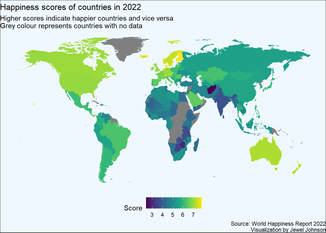
4 Plotting an interactive world map
Lets plot an interactive world map with happiness score as a variable, where greater scores indicates happier countries and vice versa. We will be using the {leaflet} package in R for plotting the world map.
We have to download the world map data which comes as a .shp file.
Run the codes given below to download the .shp file and load the .csv file required to plot the map. For plotting the interactive map, we will be using the {sf} package for reading the .shp file and the {leaflet} package for plotting the map.
# loading the .csv file which was downloaded
# please change the location to where your .csv file is kept
hap_pre <- read.csv("datasets/2022.csv")

# renaming column names of ease of use
colnames(hap_pre)[1] <- "rank"
colnames(hap_pre)[2] <- "country"
colnames(hap_pre)[3] <- "score"
hap_pre <- hap_pre[-147,]

# the score values are separated by commas
# let us change that to dots
hap_pre$score <- scan(text=hap_pre$score, dec=",", sep=".")

# selecting country and score columns
hap <- hap_pre %>% select(rank,country,score)

# removing special characters in df
hap$country <- gsub("[[:punct:]]","",as.character(hap$country))
Now that we have the dataset ready, let us download the .shp file which contains the world map.
# downloading and loading the .shp file
# please change the 'destfile' location to where your zip file is located
download.file("http://thematicmapping.org/downloads/TM_WORLD_BORDERS_SIMPL-0.3.zip",
              destfile="shp/world_shape_file.zip")

# unzip the file into a directory. You can do it with R (as below).
# the directory of my choice was folder named 'shp'
unzip("shp/world_shape_file.zip", exdir = "shp/")
Now let us load the .shp file and plot the map.
# Read the shape file with 'sf'
#install.packages("sf")
library(sf)

world_spdf <- st_read(paste0(getwd(),"/shp/TM_WORLD_BORDERS_SIMPL-0.3.shp"), stringsAsFactors = FALSE)
Reading layer `TM_WORLD_BORDERS_SIMPL-0.3' from data source
`D:\Work\GitHub\one-carat-blog\posts\word_happy_2022\shp\TM_WORLD_BORDERS_SIMPL-0.3.shp'
using driver `ESRI Shapefile'
Simple feature collection with 246 features and 11 fields
Geometry type: MULTIPOLYGON
Dimension: XY
Bounding box: xmin: -180 ymin: -90 xmax: 180 ymax: 83.57027
Geodetic CRS: WGS 84# checking which country names are a mismatch between map data and the downloaded dataset
# this is an important check as we have to join the happiness dataset and .shp file with country names
anti_join(hap, world_spdf, by = c("country" = "NAME"))# correcting country names, note that some countries are not available in the .shp file
correct_names <- c("Czechia" = "Czech Republic",
"Taiwan Province of China" = "Taiwan",
"South Korea" = "Korea, Republic of",
"Moldova" = "Republic of Moldova",
"Belarus*" = "Belarus",
"Vietnam" = "Viet Nam",
"Hong Kong SAR of China"= "Hong Kong",
"Libya" = "Libyan Arab Jamahiriya",
"Ivory Coast" = "Cote d'Ivoire",
"North Macedonia" = "The former Yugoslav Republic of Macedonia",
"Laos" = "Lao People's Democratic Republic",
"Iran" = "Iran (Islamic Republic of)",
"Palestinian Territories*" = "Palestine",
"Eswatini, Kingdom of*" = "Swaziland",
"Myanmar" = "Burma",
"Tanzania" = "United Republic of Tanzania")
# recoding country names
hap2 <- hap %>% mutate(country = recode(country, !!!correct_names))
# joining .shp file and the happiness data
world_hap <- left_join(world_spdf, hap2, by = c("NAME" = "country"))
#install.packages("leaflet")
library(leaflet)
library(viridis)
# making colour palette for filling
fill_col <- colorNumeric(palette="magma", domain=world_hap$score, na.color="transparent")
# Prepare the text for tooltips:
text <- paste(
"Country: ", world_hap$NAME,"<br/>",
"Score: ", world_hap$score, "<br/>",
"Rank: ", world_hap$rank,
sep="") %>%
lapply(htmltools::HTML)
# plotting interactive map
leaflet(world_hap) %>%
addTiles() %>%
setView( lat=10, lng=0 , zoom=2) %>%
addPolygons(
fillColor = ~fill_col(score),
stroke=TRUE,
fillOpacity = 0.9,
color= "grey",
weight=0.3,
label = text,
labelOptions = labelOptions(
style = list("font-weight" = "normal", padding = "3px 8px"),
textsize = "13px",
direction = "auto"
)
) %>%
addLegend( pal=fill_col, values=~score, opacity=0.7, title = "Score", position = "bottomleft" )5 Summary
I hope this post was helpful to you in understanding how to plot world maps in R. In short using {ggplot2} we have first plot a static world map using the data from The World Happiness Report 2022, then similarly using the {leaflet} package we plotted an interactive world map.
6 References
H. Wickham. ggplot2: Elegant Graphics for Data Analysis. Springer-Verlag New York, 2016.
Joe Cheng, Bhaskar Karambelkar and Yihui Xie (2021). leaflet: Create Interactive Web Maps with the JavaScript ‘Leaflet’ Library. R package version 2.0.4.1. https://CRAN.R-project.org/package=leaflet
Pebesma, E., 2018. Simple Features for R: Standardized Support for Spatial Vector Data. The R Journal 10 (1), 439-446, https://doi.org/10.32614/RJ-2018-009
Tutorial on plotting interactive maps in R.
Source for
.csvfile of World Happiness Score of countries 2022. Compiled by Mathurin Aché in Kaggle.com
Reuse
Citation
BibTeX citation:
@online{johnson2022,
  author = {Johnson, Jewel},
  title = {The {World} {Happiness} {Report} 2022},
  date = {2022-05-20},
  url = {https://sciquest.netlify.app//posts/word_happy_2022},
  langid = {en}
}
For attribution, please cite this work as:
Johnson, Jewel. 2022. “The World Happiness Report 2022.”
May 20, 2022. https://sciquest.netlify.app//posts/word_happy_2022.